
Welcome to a transformative journey through the spectrum of color. Have you ever considered the profound impact that color has on your well-being? Today, we delve into the science of color psychology to empower you with the knowledge to curate a living space that not only pleases the eye but also nurtures the soul.
The Scientific Underpinnings of Color Psychology
Color psychology is an interdisciplinary field that marries the scientific and the emotional, exploring how different hues can influence our state of mind and overall well-being. Research published in the “Journal of Environmental Psychology” reveals that warm colors like red and yellow can foster social interaction and create a sense of warmth, while cool colors like blue and green can induce a state of calm and relaxation.
Crafting a Wellness-Focused Color Palette
The Warm Spectrum
Red
- Psychological Impact: Energizing, stimulating
- Wellness Application: Consider incorporating red in spaces designed for physical activities, such as a home gym, to elevate your energy levels.
Orange
- Psychological Impact: Optimism, enthusiasm
- Wellness Application: Orange is highly suitable for creative spaces or dining areas where lively, enriching conversations are encouraged.
Yellow
- Psychological Impact: Happiness, positivity
- Wellness Application: Yellow is an excellent choice for spaces where you wish to instill a sense of optimism, such as a breakfast nook.
The Cool Spectrum
Blue
- Psychological Impact: Calmness, serenity
- Wellness Application: Blue is ideal for bedrooms or bathrooms where the primary objective is relaxation and rejuvenation.
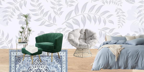
Green
- Psychological Impact: Balance, renewal
- Wellness Application: Green is perfect for spaces where you desire a connection to nature, such as a reading nook with a garden view.
The Neutral Palette
White
- Psychological Impact: Purity, simplicity
- Wellness Application: White serves as an excellent backdrop for minimalist designs and spaces intended for reflection and meditation.
Grey
- Psychological Impact: Neutrality, sophistication
- Wellness Application: Grey is particularly effective for professional or formal spaces like a home office.
Black
- Psychological Impact: Power, elegance
- Wellness Application: Use black sparingly as an accent to add depth and dimension to your space.
Guidelines for Selecting Your Palette
- Purposeful Design: Begin by identifying the primary function of the space. Tailor your color choices to serve that function effectively.
- Light Considerations: Evaluate the natural light available in the space. Well-lit rooms can accommodate darker shades without feeling oppressive.
Here are some shopping ideas with Amazon affiliate links:
*Disclaimer: This blog is NOT sponsored. I use affiliate links. As a customer, you do not pay any more or less because of an affiliated link. A small percentage of the sale will go to Design Hug creator. Thank you for your support of my blog!
Red
Orange
Removable Wallpaper With Oranges
Yellow
KitchenAid Artisan Series 5 Quart Tilt Head Stand Mixer
Stainless Steel Insulated Travel Mug
Floral Peel and Stick Wallpaper
Blue
Green
Velvet Accent Chair with Ottoman
White
Grey
Floral Peel and Stick Wallpaper
Height Adjustable Standing Desk
Black
The power of color extends beyond aesthetic appeal; it serves as a tool for enhancing our well-being. For those interested in further exploration, academic journals like “Color Research & Application” and “Journal of Environmental Psychology” offer in-depth insights into the psychology of color.
Your living space should be a sanctuary that reflects not just your aesthetic preferences but also your aspirations for well-being. As you embark on this transformative journey of color selection, remember that each hue offers an opportunity to enhance your life in meaningful ways. Choose wisely, and let the colors elevate your everyday experience to new heights of wellness.